Thematic Analysis of Certify Helpdesk Data - Affinity Mapping
As part of the SBA Certify project, the project manager tasked me with analyzing and organizing user feedback from hundreds of helpdesk tickets to identify recurring issues and inform UX improvements.
I employed an affinity diagramming approach to efficiently synthesize the large volume of qualitative data into clear, actionable insights. This method allowed for a concise, visual grouping of themes from diverse user-reported problems.
Process:
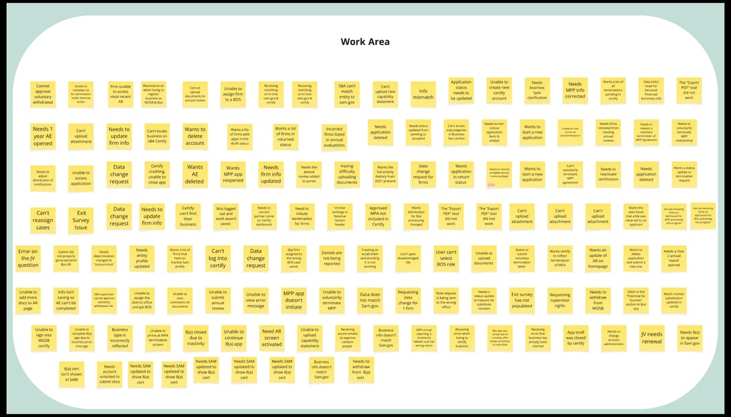
Reviewed each ticket individually
Captured the core issue and context on digital sticky notes
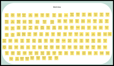
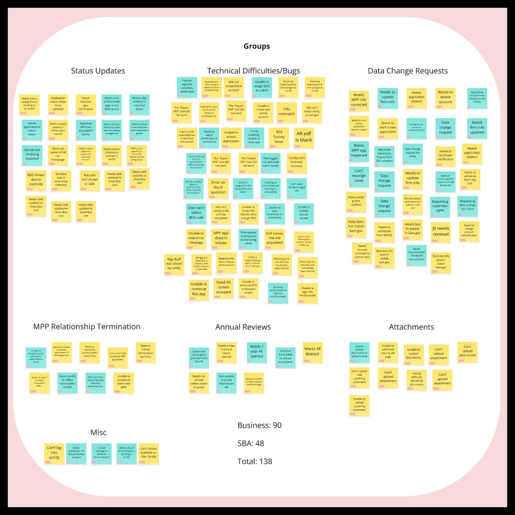
Grouped notes iteratively by similarity to reveal dominant pain points and patterns
Grouped tickets by issue type and color-coded them to distinguish internal vs. external user feedback
The resulting affinity diagram enabled the project manager to quickly identify the primary problems reported in the Certify Helpdesk. It facilitated a team ideation session to generate solutions for newly surfaced issues and provide status updates on known issues, ultimately guiding prioritized UX enhancements and reducing support friction.